
How to Nail the Basics of Packaging Design
How to Nail the Basics of Packaging Design
From the mouth of a packaging designer

Hey everyone 👋 and welcome to issue #7 of The WBB Playbook.
Quick intro for the new folks; I’m James and each week I’m tackling a different topic related to selling and/or marketing craft beer.
This week I’m looking at another topic close to my heart - packaging design!
Before we start, if you’re enjoying the emails, then I’m sure you know someone else who would too. I’d be really grateful if you would forward this on or even better, share by popping your thumb on the button below.

Packaging design in beer has come a LONG way in the past decade.
From this 👇

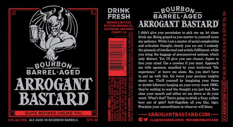
To this 👇

But, despite the improvements in design that we’ve seen in recent years, all too often I still see breweries getting the basics wrong.
Whether it’s trying to be too clever or fancy with the design. Or totally failing to think about what info the customer actually needs to help them make their choice.
In a space as new and, let’s face it, confusing to newbies as craft beer is, good clear packaging design is more important than ever.
With that in mind, for this week’s post I spoke to a leading packaging designer to get his take on the most important core principles to take into account when thinking about your packaging.
A caveat before we start
This is not a ‘How To’ on design, illustration, pretty pictures etc. Whilst those are all super important in making sure that your product stands out, this post is deliberately focused on the basics. The boring but super important stuff, if you will.

Oh, and by the way - if you’d like a second opinion on your brand and packaging, then stay tuned until the end of this post for info on the launch of the FREE WBB Playbook Brand Audit.
Let’s dive in 🏊♀️
James Randall is a senior packaging designer at P&W, one of London’s most prestigious design firms, and has worked on a host of projects covering chocolate, soft drinks and, yes, craft beer!
I was lucky enough to grab some time to pick his brain on what brands should be thinking about when it comes to nailing the basics on their packaging.
What are the most important elements to have clearly displayed on a product's packaging?
I think in it's simplest form, the most important elements to get across are:
1. what is the product
2. what is the brandOn average, a consumer will spend a maximum of 5 seconds looking at the product so you need to make sure that you can answer these 2 questions in that time.
Supermarket buyers talk about passing ‘the 5ft test’. In other words, does a product’s packaging tell the customer what they need to know from 5ft away.
Whilst great design might draw the eye, clear layout & visible information will convince the customer to pick it up off the shelf, or out of the fridge.
Translated into beer 💭
Make sure your logo is easy to see on the front of the label.
Make the beer style very clear.
Make the ABV easy to see.

What are the key things that help a product stand out on shelf?
When thinking about your packaging, it’s important to bear in mind that most shoppers rarely see your product in isolation - it’s usually surrounded by other products and brands.
This why you need to create 'shelf impact'.
A few good ways to do this include:
Large branding - i.e. making your logo or product name plenty big enough to catch the eye. Two of the best examples of this from the beer world include BrewDog Punk IPA or Camden Town Helles - you may not think either packaging is hugely interesting but there’s no denying they stand out on shelf to a customer who is scanning several brands.
Colour blocking - Your eye is drawn to strong bold colours which is why colour blocking is so common across product categories. Most breweries have cottoned on to the importance of colours but it’s essential to think about the range as a whole, and how all of the colours work together to create shelf stand out. Colours on the labels should contrast and complement each other. Five Points Brewing are a great example of a brewery using colour blocking extremely effectively to achieve good shelf stand out in a crowded space.
Using the SRP (shelf ready packaging) or tray as a design tool (if they are sold like that). Ok, so this is more common in supermarket settings so not relevant to all. But it’s worth considering how you can use other elements outside of the actual product itself, to stand out. Be that SRP, fridge stickers, or even can/bottle add ons - e.g. limited edition stickers.

How many fonts is too many fonts?
It depends. But however many you use, they must compliment each other.
A good rule of thumb is to stick to your brand font, a flavour (or style) font then a simple back of pack copy font.
Speaking of back of pack - what’s your advice for breweries on what to include here?
The back of pack is prime real estate so don’t waste it with dead space or overly technical details.
It provides an amazing opportunity for you to really connect with the customer and tell your story - in some ways it’s like a mini-billboard. Make sure you use it well.
Be interesting.
Be engaging.
Leave the drinker intrigued to find out more.
Finally, what’s one more piece of advice you would give breweries who are evaluating their packaging?
Remember to think about the big picture.
By which I mean, it’s really important to take the time to understand how your packaging will look in situ, alongside other brands. Too many brands just look at their product packaging in isolation and so miss some obvious floors.
What we like to do when we’re designing something new is to mock it up on a shelf, alongside examples of other products & brands that it would usually sit with. This way you can see how the design looks in situ and get a clear idea of whether it stands out amongst it’s competitor set.
So that’s a wrap ((sort of) pun intended) on our whistle stop tour of packaging design basics. Thanks to James for the tips.
The FREE WBB Playbook Brand Audit
What’s that all about? (I hear you shouting from your brewery rooftops).
In my experience, most brand owners find it very hard to see the wood for the trees when it comes to their own packaging. They’re too close to it, too familiar, too emotionally connected.
What they need is a fresh set of eyes. An impartial, objective view to help them spot any obvious issues.
As someone who has seen (and sold) hundreds of different brands and packaging, I’ve got a good sense of what works and what doesn’t.
So I’ve created the WBB Playbook Brand Audit as a quick and simple feedback form for anyone who would like some honest, objective thoughts on what’s good and not so good about both their brand in general, and their packaging in particular.
To submit your brand for interrogation, simply fill out this form and I’ll be in touch. To keep things simple and quick, I won’t be needing physical products sent, instead I’ll work from your existing brand presence online. I look forward to hopefully being helpful.
Thanks as always for reading The WBB Playbook. In the spirit of referral, please do share this if you found it useful 😍
If you have any thoughts or comments about any of the posts, hit reply and let me know. I’d love to hear from you.
Oh, and if you can spare 3 seconds, it would be great if you could click one of the 3 feedback options below - it helps me judge whether I’m on the right track content wise.
Did someone forward this to you? You can subscribe to future issues of The WBB Playbook here 👇
How did you like this post?